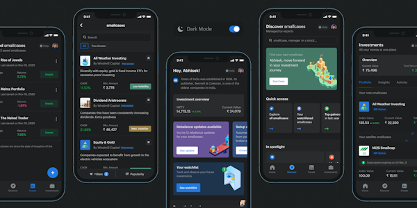
Launched Dark Mode on smallcase App
We had been receiving multiples requests from our users over social media about "when is smallcase launching dark mode?" This was one of the primary reasons we picked up this project. Initially, we thought it would be a piece of cake by just creating a dark palette of our existing colour tokens but when we actually started, it was a big chaos.
- I had to revisit all the shadows, borders, illustrations, icons, and banners in the order they pass WCAG AA & AAA contrast levels for better readability and visibility
- Borders were replaced by elevated depths - the further or higher the surface is, the lighter it becomes
- Greyscale composition in the spot illustrations was given an opacity so that one HEX value would cater to both light and dark theme
- We use 4 variants of primary text colour: #2F363F, #535B62, #81878C, #CECECE for all the heading styles and body copy in the light theme. For the dark theme, we had to use one single colour i.e. #FFFFFF with 4 different opacity levels
- In light theme we use pastel colours in our banners, so we had to pick a darker shade of it for the banners in dark theme
Finally, after a hundred DQA rounds, we were able to ship out the dark mode for the smallcase app. But we are always in the learning place and the room is open for feedback to improvements.
Download the smallcase app here.