This week, Print for Figma (PFF) was featured on the Figma Community homepage as one of "16 new plugins worth checking out"!
As a celebration, I decided to take a stab at redesigning the plugin's branding and color scheme.
My first thought when approaching this redesign was a question...
As a celebration, I decided to take a stab at redesigning the plugin's branding and color scheme.
My first thought when approaching this redesign was a question...
How can I make someone think "print" when looking at the plugin page?
Additionally, I had a few requirements in mind:
- Maintain some similarity to the original design, as to not confuse users into thinking this was a different plugin than they're used to.
- Use design elements and colors that echo the world of print design.
- Be eye-catching and memorable.
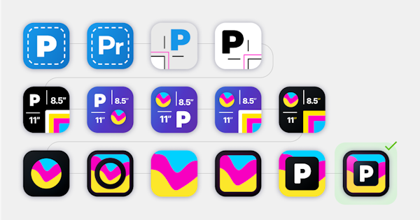
I began first with the icon - I had some issues with the original, namely I wasn't sure if the dotted white box sufficiently implied print design. Because of this, my first attempts at a new icon involved visual elements commonly associated with print design - specifically bleed and crop marks. The only issue was that to properly convey these elements, I had to use specific colors that didn't provide a sense of identity - so I continued to look for other ways that the design could really imply print design.
After some deliberation, I decided to explore a CMYK color scheme. Even though PFF doesn't currently support CMYK proofing, the color scheme seemed like an effective way to create brand identity and invoke the common association between print and the CMYK color space.
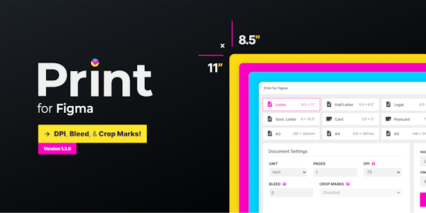
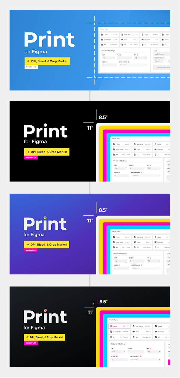
I then went through some iteration, going from a pure black background to a colorful gradient more similar to the original, and then finally back to a black background again - this time with a very subtle gradient. To compensate for the muted background color, I applied some of the CMYK colors to the crop mark / dimension motifs, as well as to the dot ("tittle") of the "i" in "Print".
This colorful tittle inspired further iterations of the icon. I played around with some options, finally landing on a version that satisfied requirement #1 (maintain similarity to the original design). I found that the "P" was very recognizable even at small sizes, and existing users of the plugin would be able to recognize that it was an iteration of the original design and not be confused as to what the plugin was.
After some final tweaks, I pushed the new branding live to the Figma community. Check out the visuals in the attached images! 😀
After some deliberation, I decided to explore a CMYK color scheme. Even though PFF doesn't currently support CMYK proofing, the color scheme seemed like an effective way to create brand identity and invoke the common association between print and the CMYK color space.
I then went through some iteration, going from a pure black background to a colorful gradient more similar to the original, and then finally back to a black background again - this time with a very subtle gradient. To compensate for the muted background color, I applied some of the CMYK colors to the crop mark / dimension motifs, as well as to the dot ("tittle") of the "i" in "Print".
This colorful tittle inspired further iterations of the icon. I played around with some options, finally landing on a version that satisfied requirement #1 (maintain similarity to the original design). I found that the "P" was very recognizable even at small sizes, and existing users of the plugin would be able to recognize that it was an iteration of the original design and not be confused as to what the plugin was.
After some final tweaks, I pushed the new branding live to the Figma community. Check out the visuals in the attached images! 😀